Print vs. Web - 4 Important Technical Differences

Adobe Muse is the perfect web design tool for print designers to transition into web design. In fact, it’s so seamless that we’ve even covered the similarities between InDesign and Muse before here.
Despite the ease of use and similarities, there are a few notable technical differences that knowing in advance will help to ensure your final design looks best for users. If you're new to web design from the print world, this article will give you a quick rundown of key differences between setting up files for print and web.
Color
As a print designer, you may be used to the four-color subtractive color mode CMYK. All colors created in this mode use a combination of cyan, magenta, yellow, and black. In web design, the three-color additive color mode RGB is used. All colors on a digital screen or monitor are created with dots of red, green and blue light.
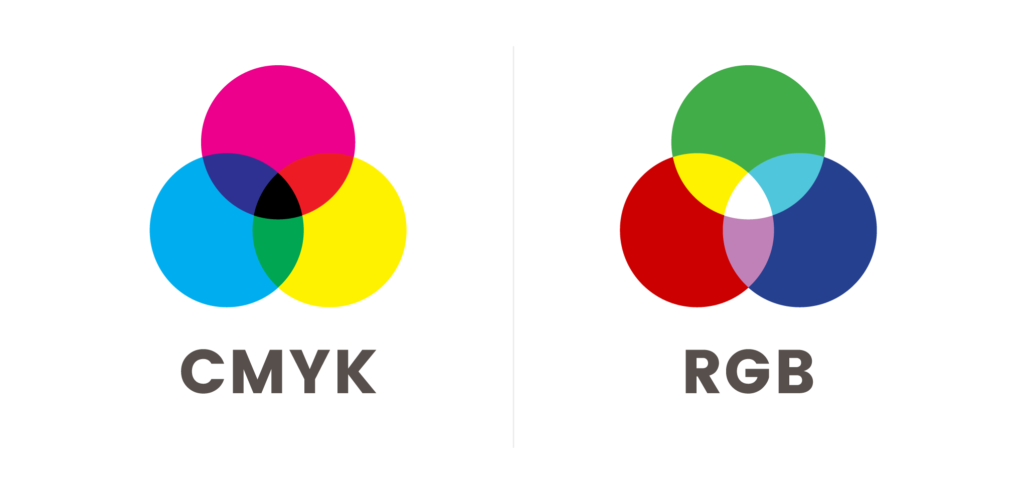 RGB colors are typically presented in two ways. The first is using three sets of values ranging between 0 to 255; these refer to the value of red, green and blue light that renders on the screen. The second is with a six-digit code known as hexadecimal values, aka hex codes. Within Adobe Muse, you can use either.
Minimum Resolution
While both DPI and PPI refer to resolution, DPI (dots per inch) is used for print and PPI (pixels per inch) is used for digital. Although many people mistakingly use DPI as a term for resolution in any design context – DPI is irrelevant for web.
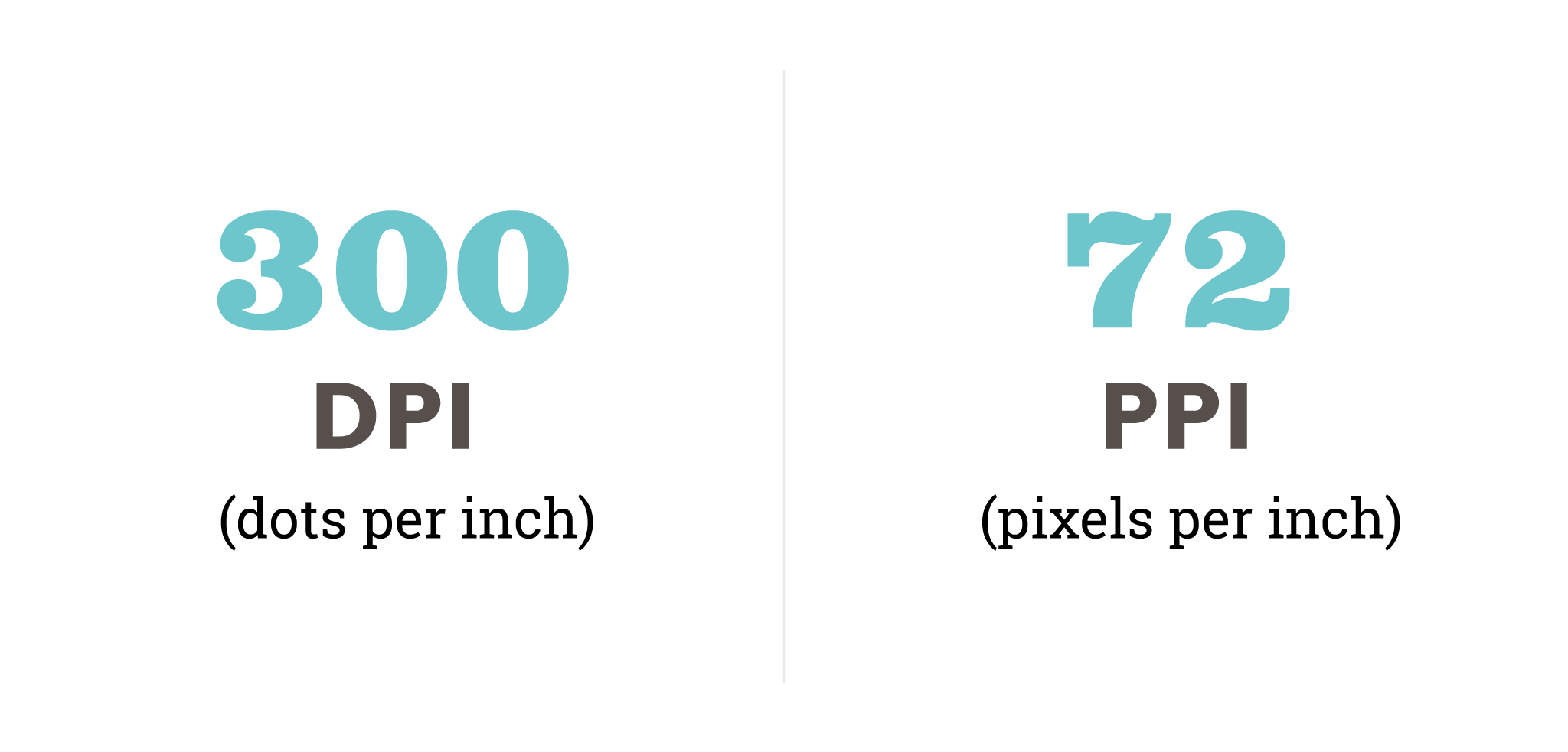
While 72 PPI is the recommended minimum resolution, to achieve the highest quality looking images you may want to consider using a higher PPI. Windows default is 96 and Mac is 72, but some devices go up to 120. Keep your images between 72 and 120 to ensure that your images are the same ratio device-wide. One more thing to note, having a higher PPI will impact your overall file size, which will affect the image's loading time for users.
*Depending on the printer, a lower DPI may be acceptable.
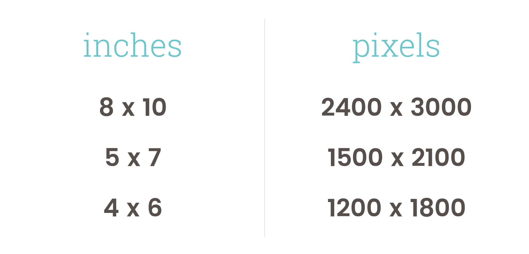
Image Dimensions
The size of your images should be based on the content area’s width. Most websites have a content area that is somewhere between 500 and 1024 pixels, so resize your images to a standard size (x2 if you want to consider retina display).
Remember when saving your final files that file size matters. There is no reason to have print-ready photos online (unless someone is downloading them directly from your website), because it only leads to slower load times and frustration for the user.
Common Document Sizes – Inches to Pixels
Letter: 8.5 x 11 = 2550 x 3300
Legal: 8.5 x 14 = 2550 x 4200
Ledger: 11 x 17 = 3300 x 5100
File Types
Some print file types may also be used on the web, but it is important to know which file type is best for your image. Below is a list of the most common file types used on the web and what types of projects you can use them for.
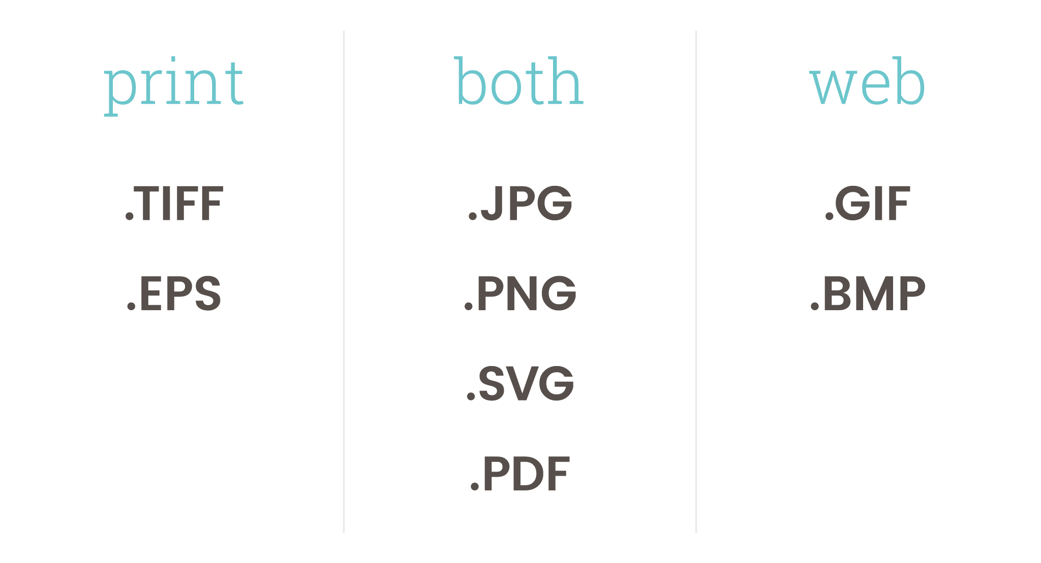
JPG (or JPEG) is a lossy graphic (if compressed) that is best for still photography or images with a lot of color and shading.
PNG offers two different options. PNG-8 works well for small icons and simple digital art. PNG-24 is best for graphics that have transparency or fading, as well as imagery like icons and illustrations. PNG-24 has lossless compression, which means that sometimes these files can be larger than a JPG – so try to be conscious of your final file size when saving for the web.
PDF preserves a file's original content. Regardless of how the file is viewed, a PDF will keep the look of your design intact – making it the perfect option for documents that need to be viewed or printed.
SVG preserves a vector graphic's scalability, which makes it perfect for graphics like icons and logos.
GIF is ideal for animations, as well as transparent images and simple small graphics with a limited color palette. One thing to note is that a GIF's color capabilities are limited in comparison to PNG or JPG, but the file size is usually very small – making it a great option for web.

Thanks for this… nice clear descriptions/comparisons. This blog entry will be handy to share with some clients when my explanations aren’t getting through to them. :)