Building Mobile-Friendly Websites with Adobe Muse - Google SEO Guideline
Google recently announced that it will be rolling out a new mobile search algorithm on April 21st, and sites that are not considered “mobile-friendly” could see a drop in rankings. This news has caused many Muse website owners to panic, but there is no need to worry – the following SEO guide will help ensure your Muse site will safely pass the mobile test.

First, here are some important details and considerations:
1. This change only impacts searches made on mobile devices.
The goal of this update is to improve the mobile search experience for Google users. Your desktop site and its rankings will NOT be impacted. It has been confirmed by Google that if your desktop site ranks well on a desktop searches, you’re not going to see a change. You will, however, see a drop in rankings on mobile-only searches if your site isn’t optimized.
Consider, however, that this may change in the future as Google evolves.

2. Do you even care about mobile search rankings?
For businesses that are locally based, mobile search traffic could be essential – users are finding your business while they are on-the-go. For a business like MuseThemes, 99% of our subscribers do so on a desktop computer, so mobile rankings aren’t quite as much of a concern. With that said, we’ve already tested and ensured our site is good to go.
We recommend you check your Google Analytics, and determine what devices visitors are using on your site. If mobile traffic is a very small percentage of your visitor base, then feel free to take your time implementing the changes.
3. Muse does a great job of passing the Google Mobile-Friendly test.
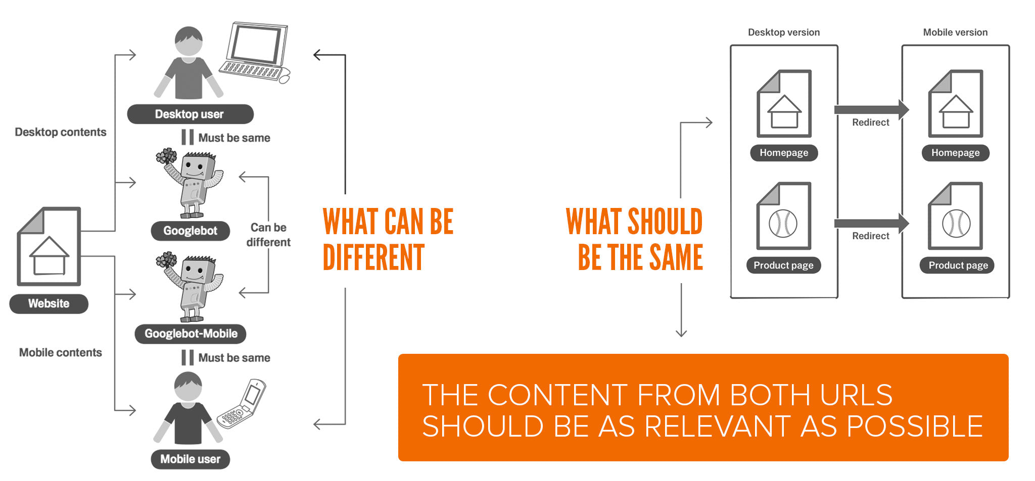
Google has confirmed that easy-to-index mobile sites will rank highest, regardless of how mobile versions are implemented. This means there is no difference between a responsive site and an alternate site approach (which is used by Muse) when it comes to mobile rankings. Usability has always been Google’s highest priority, and this mobile change is no different.
Why is Muse extra-awesome for mobile rankings?
Redirecting users to an alternate mobile website gives you an often unrealized advantage above responsive websites – mobile specific keyword optimization. You can optimize a separate mobile site for a whole different set of keywords that may be more appropriate for visitors searching from their phones. Responsive sites use the same content / meta data regardless of the visitor’s device, so you can only optimize it for one set of keywords.

4. Tablets are not included.
This Google update is for mobile devices only. Tablet devices are not included…yet. However you can be 100% sure they will be eventually, and you may want to apply the same concepts below to your tablet site (and avoid any future panic).
5. Did you build a mobile version of your site in Muse?
Google is obviously placing a huge emphasis on having a mobile website, so there is no better time to build one in Muse. If you’re a freelance designer, this could be a great opportunity to approach potential clients, inform them of the Google update and present a proposal to build a mobile version.
It’s possible that your desktop site could still pass the mobile-friendly test – this is NOT a long-term solution, and it won’t last. We strongly recommend you build a separate mobile site to be safe.

TEST YOUR SITE / CONFIRM MOBILE-FRIENDLY
Google has released a new mobile-friendly testing tool for website owners to use. This tool analyzes only the specific page URL entered, it will not confirm your entire site will pass. Be sure to input all appropriate pages into the tool to check for compatibility.
Your site will either pass or fail with this tool. There is no middle ground – you’re either mobile-friendly, or you’re not.

Also, check for the “mobile-friendly” badge on your mobile search results. Search for your site on a mobile device, and look for this block of text in the results:
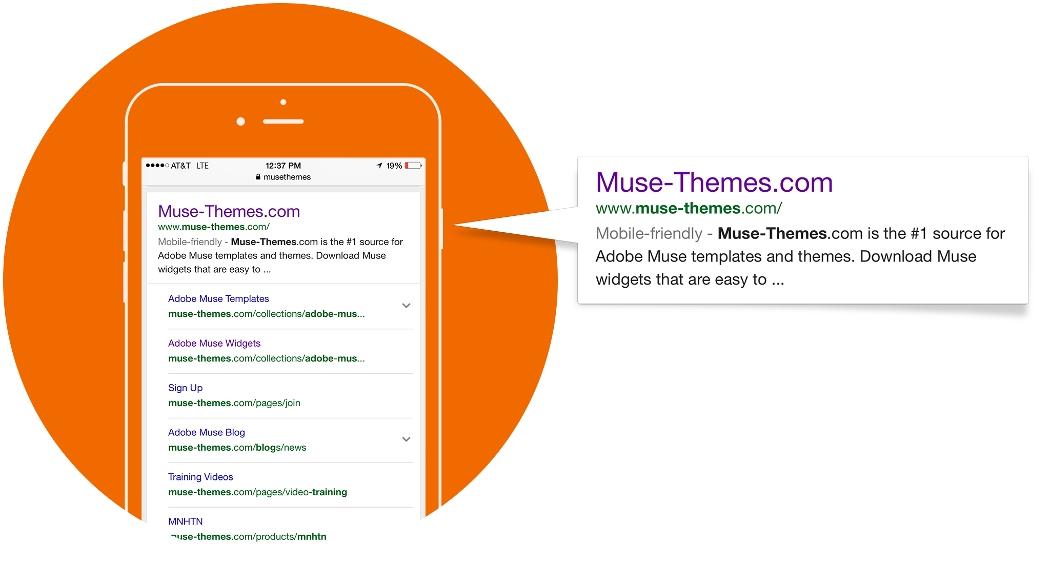
How to use the mobile testing tool:
Step 1 - enter in your primary desktop URL. The mobile test tool should display your alternate mobile site (if you've built one). Muse automatically adds code to your desktop site to redirect it to the mobile version, and we’ve confirmed Google approves of this code. Bravo, Muse team for doing it right behind the scenes!
Step 2 - enter and test all of your other mobile site pages. This will help you identify any possible design changes that need to be made. Make note of any errors presented, as we’ll explain how to revise your site design to fit Google mobile-design recommendations.

IMPLEMENT MOBILE-FRIENDLY DESIGN
Even if you have built a mobile site in Muse, Google may still fail your site due to specific design considerations. Mobile design is very different than desktop – you need to carefully consider readability (text size), ease of use, button sizing, “heavy” content like videos, etc. Google has published guidelines around mobile-friendly design, but here are a few key elements for you Muse users:
1. Don’t Make Tiny Buttons!
Officially called “touch targets and spacing,” this ensures users can comfortably press a button on your site with their fingers. If you place two or more buttons very close together, a user may accidentally push the wrong one. Consider ensuring touch-targets are a minimum of 50px by 50px and you should be safe.
Spacing between buttons is also important – we’ve heard 20px - 32px worth of space is a safe bet.

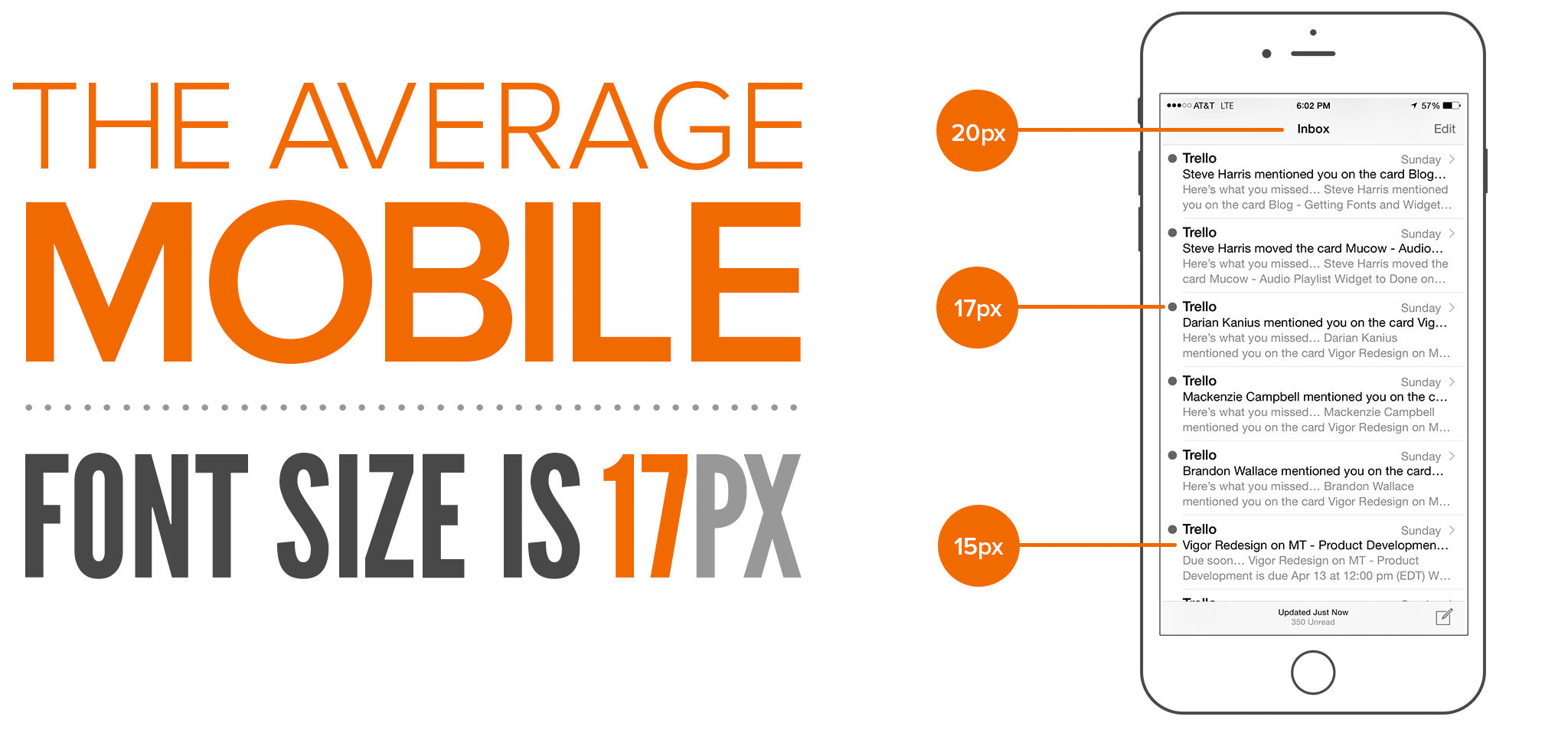
2. Avoid Small Fonts
Mobile users are often distracted or on-the-go, and it’s important to ensure that they can read the text or content on your site easily. You shouldn’t need to zoom in on a mobile site (many automatically restrict you from doing so) so take advantage of the user’s ability to scroll, and build content at a comfortable size. What’s safe? 16px or up we say.
3. Avoid Heavy Widgets
Good mobile sites are light, simple, and fast. Save your parallax scrolling effects and high-resolution video galleries for the desktop experience. Google has confirmed inaccessible content, such as flash will have a significant negative impact on rankings.
We at MuseThemes do our best to build mobile-compatibility into all of our widgets. However, with that said, you still need to ask yourself if adding a complex widget to a mobile site really improves the user experience? If it doesn’t, then remove it and find a faster or easier way to display the content.
4. Page Load Speed
Keep your mobile sites light! Users may not always have a wifi connection, and it’s inappropriate to ask them to download 100mb videos on their data plan. Mobile pages should load quickly, and images should be optimized for maximum compression. Complex widgets will add unnecessary bulk to your mobile design, so avoid them if possible.
This is another area where Muse excels! A separate alternate Mobile site gives you maximum flexibility for changing up content or optimizing images based on the user’s device.
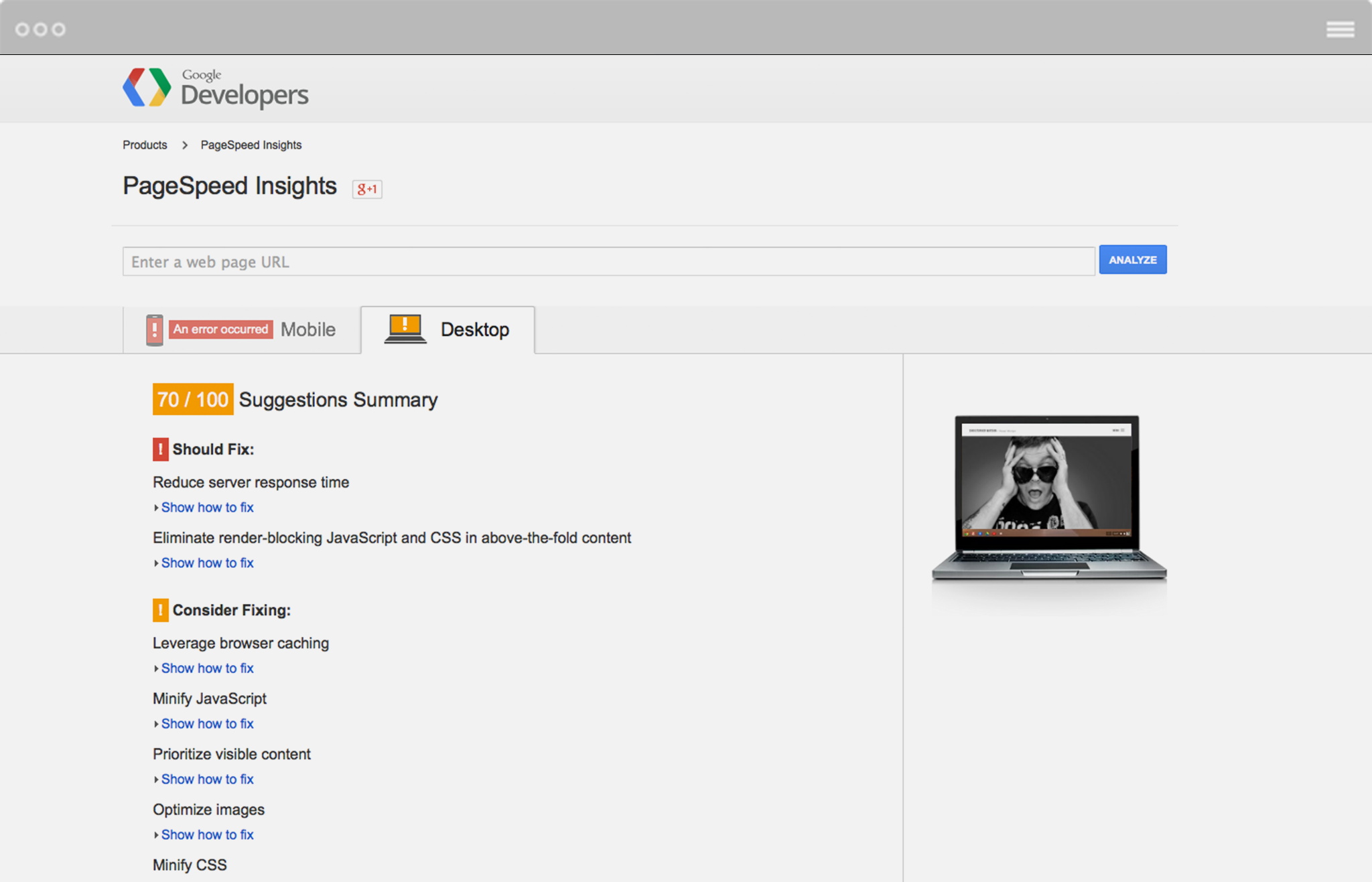
Want to check your mobile page load speed? Use this tool: https://developers.google.com/speed/pagespeed/insights/
5. Use Relevant Cross Links
A cross link is a link that goes from your desktop site to your mobile site, and perhaps back again. Relevant cross links mean that the appropriate pages on each site are being linked together. Don’t link your desktop “About” page to your mobile portfolio. Google expects that users will find the relevant content they are looking for on either version, so be sure to point them in the right direction.
What if you don’t have a mobile “Portfolio” page to point to from your desktop portfolio? Don’t bother linking – seriously, do nothing and you won’t be penalized.
SUMMARY
There are several technical factors involved in passing the Google mobile-friendly test; fortunately the Muse team has addressed many of them for you ahead of time. Your job now is simply to build an awesome mobile site for your users as a companion to your desktop version.
Design that site with mobile usability in mind, using comfortable text and button sizing, nice light content, and a simple structure. Your site will pass the test with flying colors.
VIDEO OVERVIEW:
BONUS! BUILDING MOBILE SITE FOR NON-MUSE CLIENTS
There’s a huge opportunity presenting itself with Google emphasizing mobile rankings. You can generate significant additional revenue-building mobile versions of websites for your design clients. This includes website owners who haven’t even built their site in Muse. With a simple line of code and your ability to build a Muse mobile site, you can tackle any web platform that isn’t mobile optimized. Here’s how it's done:
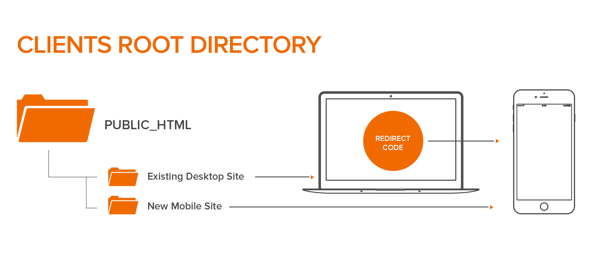
- First find out how the existing website is built. It could be pure HTML, Wordpress, or another content management system (CMS). Next, determine if they have a mobile site or not – if they don’t, approach the client, inform them of this mobile rankings shift, and offer to provide a solution.
- Build their new mobile site in Muse, as a mobile-only layout. No desktop layout required here. Once you’re done, you can export the site as HTML (File > Export HTML) and upload it to the clients hosting server using FTP. Be sure not to overwrite their existing site – just place this new mobile version in a subfolder called “phone” or “mobile.”
- Copy / paste the mobile redirect code below, into the <head> area of their current desktop site. This code will detect the screen size of a visitor’s device, and redirect them to a new location of your choice.
Before embedding this code, just make sure to update the URL to point to the location of your newly uploaded mobile site.
<script type="text/javascript">
<!-- if (screen.width <= 800) { window.location = "http://www.domain.com/phone/index.html"; } //-->
</script>
The code above tells the browser to send users with screen sizes LESS THAN 800px to the alternate mobile layout.
Example:
Our client’s website has not been built in Muse. His desktop site URL is http://www.museexperts.com
We design and upload a mobile-only site to a “phone” subfolder on his FTP server. The mobile site is now accessible from this URL:
www.museexperts.com/phone/index.html
We then copy and paste the code provided into the <head> area of his existing desktop site. This could be done manually in a text editor, or directly in the backend if the site is built on a CMS like Wordpress. All CMS systems allow you to place code in the head area, as it’s widely used for tracking services like Google Analytics.
We’re done! Alternate mobile site built, another happy client, and another great revenue stream for your business.
Cheers,
SH

Comments

Wow didn’t even know this was coming. This post is a life saver!!! Wickkked.

What would we do if Google didn’t keep us hopping? Thank you for the very informative article!
Now which website should I tackle first……..

We have been converting our site to mobile friendly for a while now and I can definitely see good results
We can identify if a response came from a mobile, tablet or desk top page
A lot are now coming from the mobile pages so all you hear about their popularity is right
You have to be mobile friendly

Thank you for such an insightful article. Thanks for giving us all the details needed to approach these new changes with the knowledge needed to increase our confidence!!! You guys (and gals) are the best!!!

Great! As usual!

Wow.
I never knew Google keeps tabs on us and what we are doing. Great informative article. Thanks Steve and the #musethemes-team.
Thanks as always for the help guys! Great article.