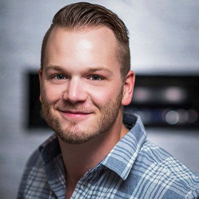
The Artist Series #01 - Christopher Watson

We are constantly in awe of the amazing Adobe Muse designers we have the privilege of working alongside. As our focus is always on extraordinary, effective themes and tools, we are handing the design-reigns to some of these notable individuals to create a unique line of templates: The Artist Series.
These designers will build sites in Muse using their expertise, experience, and individual style. Keep your eyes peeled for these unparalleled themes built exclusively for MuseThemes customers!
Our first template in the Artist Series is created by Christopher Watson. This fashion boutique-inspired site – MNHTN DOSE – combines pure style with undeniable function. Keep reading to find out more about the site and the designer behind it!
Christopher Watson on MNHTN Dose

What was your inspiration for the MNHTN Dose site?
My aesthetic vision was to simultaneously achieve strength and elegance without incorporating passé connotations of “strong”= masculine, slab type and “elegant”= feminine, frilly hand-script.
To achieve a sense of sophistication and elegance I utilized white space, loose kerning, and a traditional serif font to play off the very “fashion-forward and minimalist set-width headlines.” The “strong” aspects of the design can be interpreted through minimal decorations, clean lines, and harsher diagonal lines on the landing page.
When conceptualizing the functionality of MNHTN Dose there were two main objectives I wanted to address: scalability and intuitive flow.
SCALABILITY
I wanted to create a space that could house a substantial amount of content without compromising elegance.
Specific examples of this can be seen on the About, Blog Details, and Product Details pages.
The About page with its long scrolling side bar, is prepared to tour your audience though as much info as you’re willing to share, and hold as many supporting images as you see fit without taking away the opportunity to display large imagery to the left. As you scroll, the larger image transitions into another headline, maximizing your opportunity to include content.
You’ll also notice the side bar of the Blog and Product Details page is set to a percentage of the browser allowing you to maximize the content served up, while maintaining visual balance.

INTUITIVE FLOW
I wanted to increase the amount of “calls-to-action” (CTA) and leave no dead ends. You’ll notice these dead ends frequently on article pages, about pages, our team pages, etc. Your audience is obviously there based on a unique interest, and those interests should be addressed. A good example of this in MNHTN would be the Blog Details page:
- CTA: “Sign up to Receive an Alert”
- CTA: “Next/Previous Article”
- CTA: “Share this Article”
These CTA will personalize the experience and ultimately reinforce your business’ objectives.
Can you describe your creative process when building a website with Muse?
This question could be an article of it’s own! A lot of the time I take a very organic approach: mood boards, sketching UX, etc. Sometimes I’ll open Muse right away if there has been a significant update or a new MuseThemes toolbox release and explore new creative ways to display information. It is often dependent on the nature of the project.
Once in Adobe Muse I start by creating my site map so I can link appropriate pages as I build (believe me, its a real hassle to go through each page and figure out what is and isn’t linked because all the pages weren’t there from the beginning). The next step is to set up my rulers/grid. Its a tedious, and slow start, but once you get into the habit of doing this you’ll notice your designs looking much more “buttoned-up.”
When embarking on the actual build, I always create my “shell” first (header/footer/master-page items). I usually wait until the end to add some of the heavy-duty widgets like lightboxes and slideshows so I don’t accidentally nudge content into them.
What was the most challenging aspect of building the MNTHN site?
Hands down, the full-width grid.
What’s your favorite component of the MNHTN design?
Again, the full-width grid on the Blog and Collections pages. I think it adds a unique feature, and you’ll notice this is a 50/50 grid, with 1/4 grid left, and 1/4 grid right. These are built-in, full-width text boxes, so if you’re feeling ambitious you can actually mix and match these elements to make your own “mixed-grid” when lining them up on top of each other.

What do you think it takes to become a great Muse designer?
Assertiveness. There are so many powerful tools in Adobe Muse its easy to want to utilize them all – on every page and in every design. I think its important to be able to confidently pick the best tools for the job, and not just use them because they exist and are easy to implement.
Any clever tricks you want to share about this design?
Y’know, it is the simplest feature on the entire site and I don’t know why I don’t see it more: The expanding footer.
If you take the accordion widget and pin it to the bottom of the browser, it expands up instead of down – just make sure you “close all” before publishing.

Why do you choose MuseThemes as your primary widget provider?
Reliability, frequency of new releases, and consistent improvements. As mentioned, when a new MuseThemes toolbox or widget is released I will often just drag it on to the canvas even if I don’t have an immediate use for it, because 9/10 times it will introduce new ideas. Not only are the MuseThemes widgets powerful tools meeting a significant need, but they also inspire creativity and exploring them has become regular part of my workflow. These guys are the best in the business!
What are your thoughts on the future of Muse for professional designers on the web?
I always compare the evolution of Adobe Muse to the recording industry’s evolution from analog to digital. At first, there was some skepticism, but digital proved its place. I notice more and more designers with both print and digital experience are adopting Adobe Muse into their workflow. Just last week I was approached by a service marketing agency looking for designers with Adobe Muse experience because they are now building their clients micro-sites with it. So needless to say, the future of Muse is looking bright.

How do you stay on top of current design trends (favorite blogs, industry sites, resources)?
I really enjoy digital resources like CreativeBloq.com and SmashingMagazine.com. AWWWards.com is always blowing my mind and has a collection of what I feel are the best websites to ever exist, but it’s easy to get trapped in the digital space. I make a conscious effort to absorb as much of the real world as possible – architecture, the conversations of passers-by, store-front displays, that girl’s expression in the coffee shop who never speaks to anyone. I think it’s when you bring these things into the digital space that the real magic happens.
IMPORTANT NOTE:
MNHTN Dose is an advanced theme, so we are building comprehensive training to walk you through all the features. We were just so excited about it that we wanted to get it out immediately so you can start exploring!
MNHTN Video Overview
Comments

Stunning!

I love it! Can’t wait to make use of it soon for my next project. It’s definitely going to further my Muse skills. Really classy! Thank you!

Super schön gemacht, Kompliment!

Very beautiful and inspiring. I hope that the manual will arrive soon. Then I can work with it.
Looking forward for more ‘artist’ templates.

simplicity is high wisdom. Bravooo

very inspiring
very beautiful
makes me want to work with it

It’s the most beautiful site ever! Doesn’t even matter that it’s advanced for a beginner like myself. I’m loving it and it’s giving me a big lesson on discovering what Muse has to offer and how to work with Muse. Wonderful Christopher!

So excited by the Lynda.com training around this fabulous new product. I guided college students using tables, slices, animation and digital media for some time, but when Google stated it would not be supporting sites unless they interacted with a variety of devices, we jumped into Muse. Glad there is another great Adobe product to support the new generation!
Hi Steve this template is awesome some great features in this site. cheers